
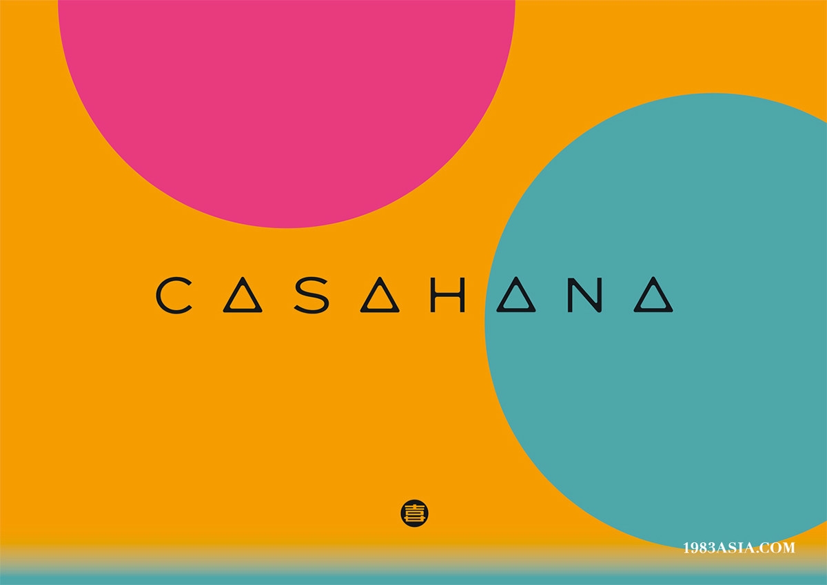
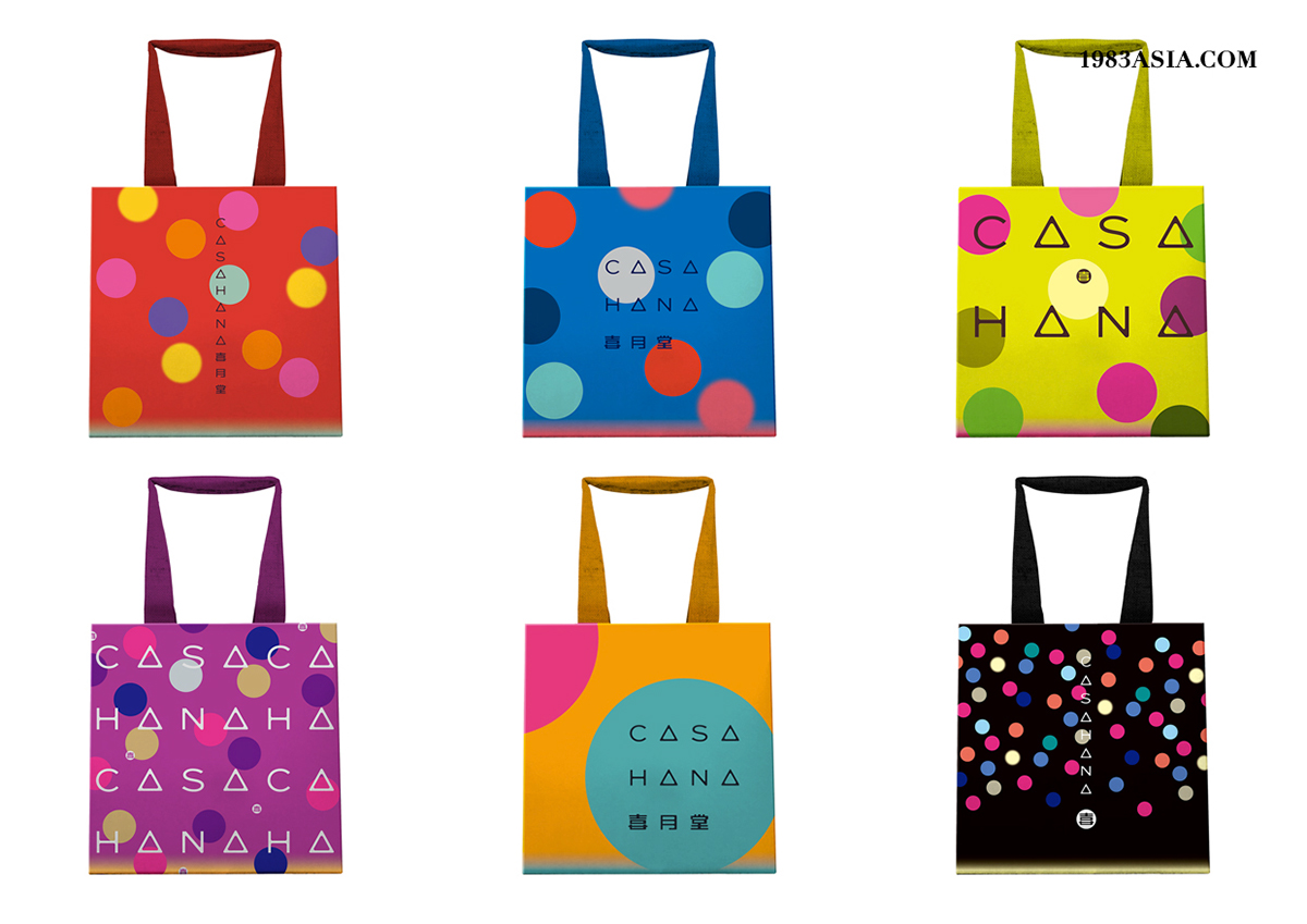
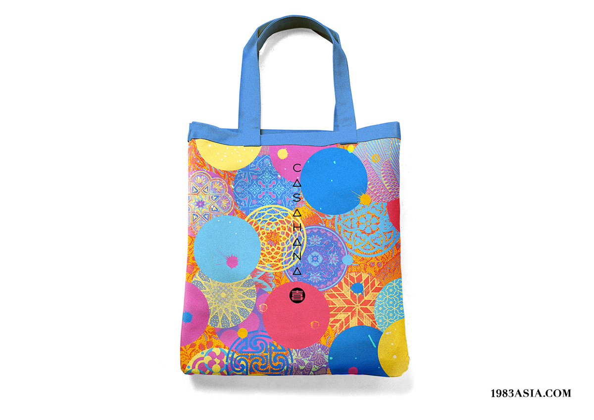
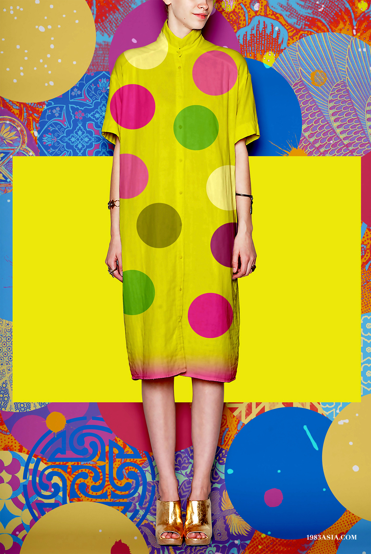
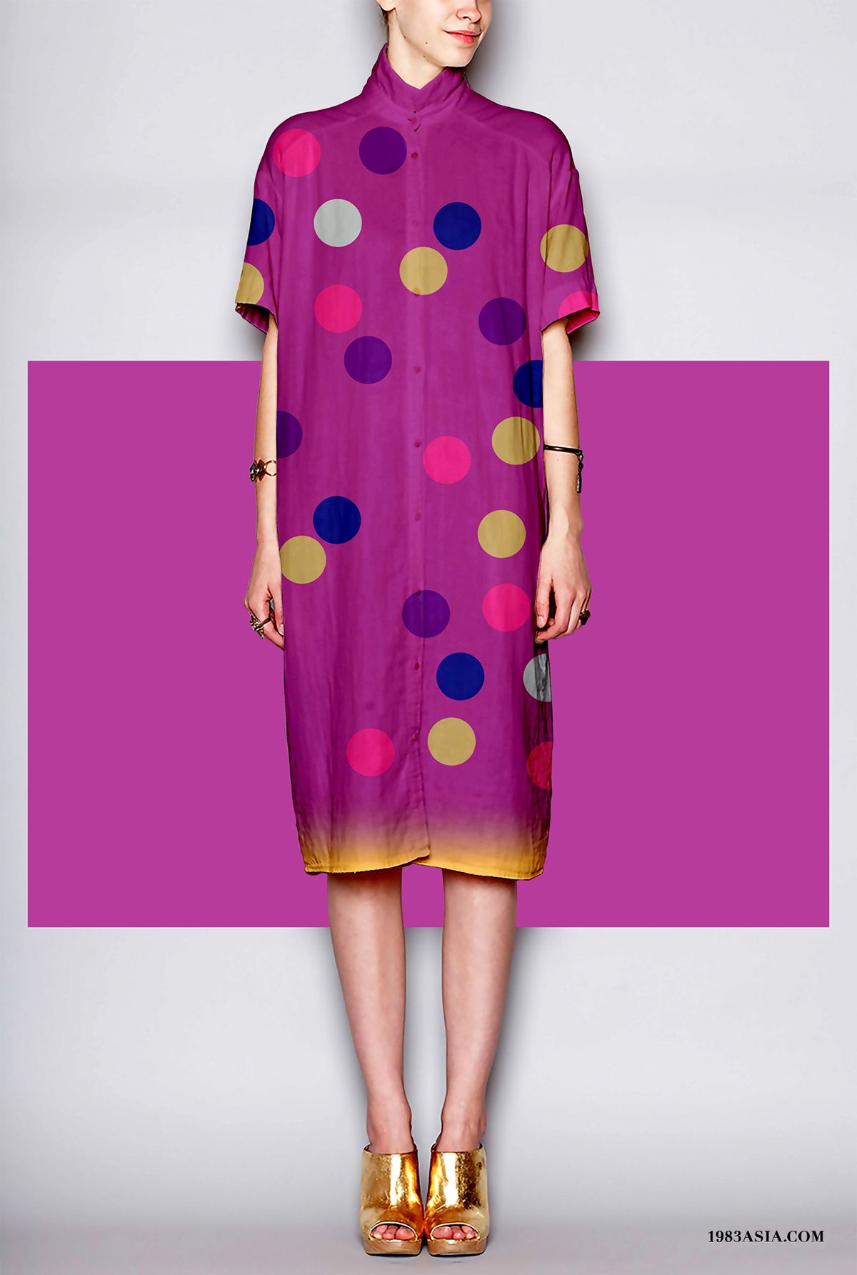
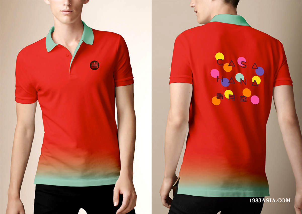
CASAHANA 喜月堂
CASAHANA is a food manufacturer of Malaysia specializing in pastries for “festivals and ceremonies”. Now it faces the challenge of international brand positioning and younger customer base, and hopes to improve its brand image by branding; therefore, it needs a “universal” story. From its history, we have extracted the concept of “delight & moon”. Twelve full moon days not only deliver the brand’s original intention of “one ceremony one month” but also serve as the carrier of the brand’s diverse development and highlight its unique presence in the marketplace.
喜月堂,是马来西亚一家以“节庆”为核心的食品企业。品牌发展多年,现正面临国际化定位转型与客群年轻化的挑战,并且希望通过品牌设计改善以往模糊的形象。因此一个具有“包容性”的故事型设计是品牌所需要的。我们从品牌历史中提炼出“喜月”为概念,十二个满月除了传递“一月一庆”的品牌创办初衷外,更希望以此为符号承载品牌多元发展的需求,从整体塑造品牌在市场上的特别存在。
CATEGORY:BRANDING DESIGN 品牌設計
AGENCY:1983ASIA
DESIGN:SUSU & YAO 苏素 & 杨松耀
YEAR:2014
COUNTRY:MALAYSIA, KUALA LUMPUR 马来西亚, 吉隆坡

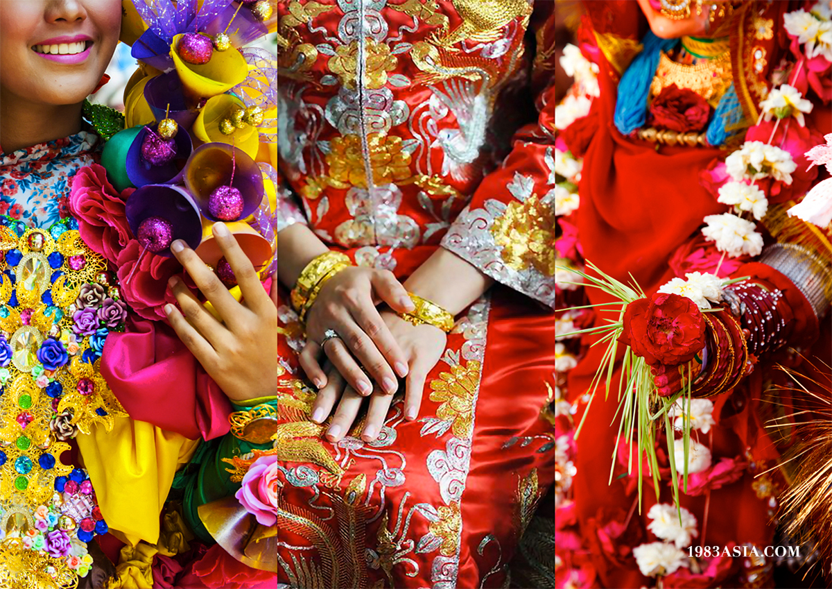
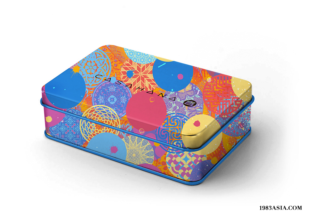
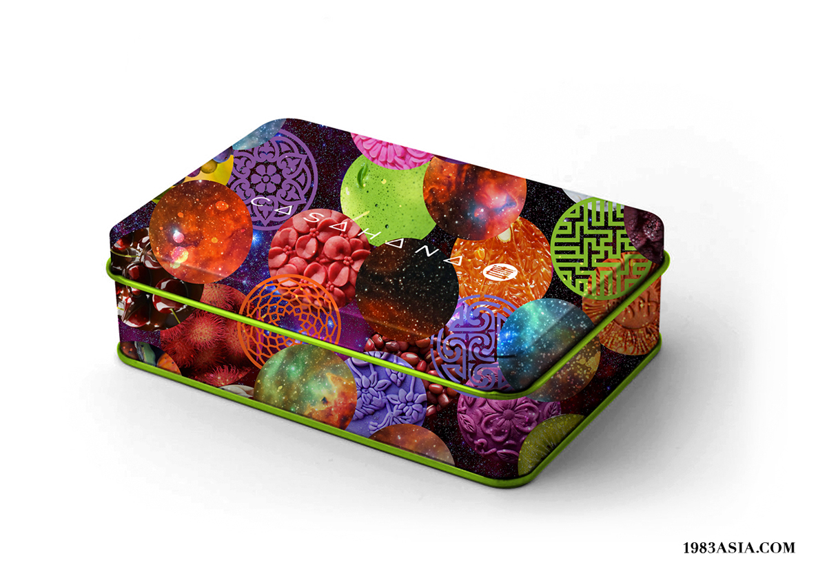
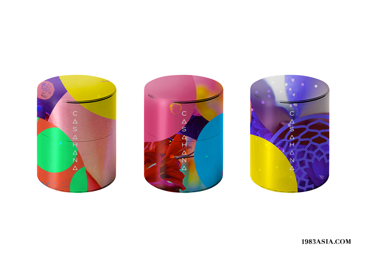
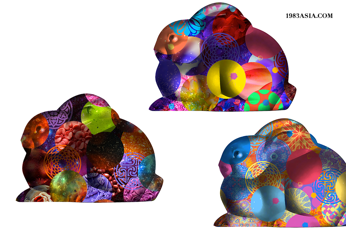
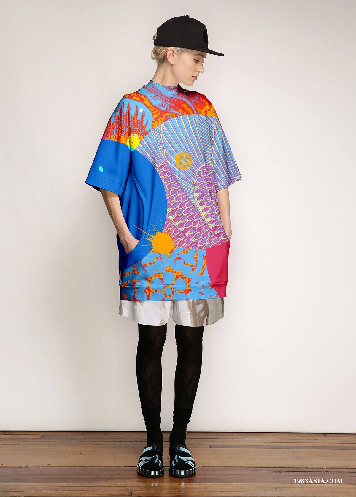
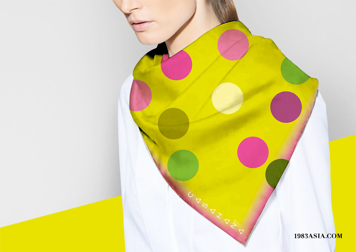
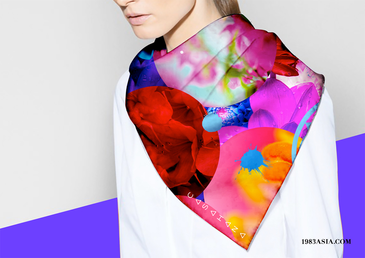
Designers are also like translators, this time we will translate the color of “taste”. “Color” is a key to this brand design. We have extracted eye-catching “Asian colors” from colorful cultures of festivals (particular Holi of India inspired us). We create a flexible image for the brand. We’d like to invite friends around the world to this gourmet party, all colors, and different colors.
设计师就像一个翻译,而我们这次负责翻译“味道”的颜色。“色彩”是此次设计的一个关键,我们从丰富的节庆文化提炼出艳丽夺目的“亚洲色彩”( 尤其印度的胡里节更是给了我们灵感),结合喜月堂创新混搭的产品口味。通过丰富的配色系统为品牌创造一个灵活多变的形象,用色彩打破肤色的界限,我们想邀请来自世界不同的人们加入这个普天共庆的美食派对。

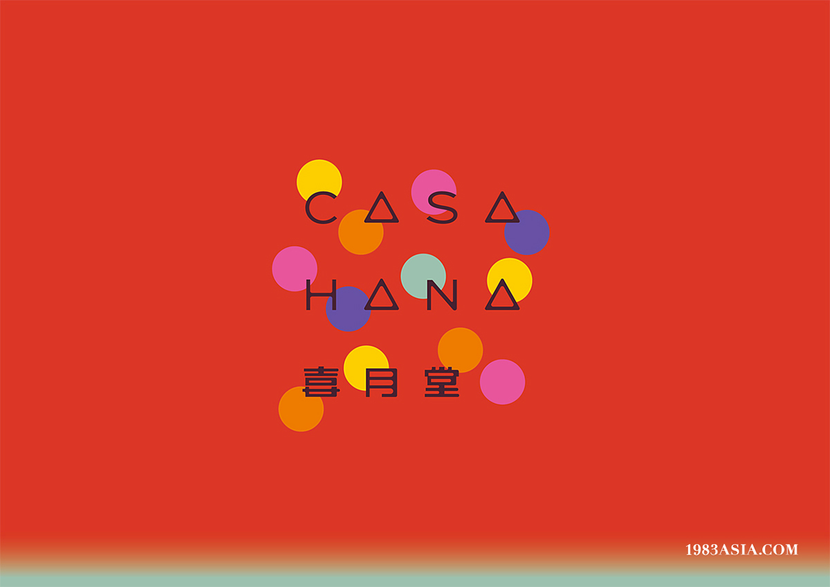
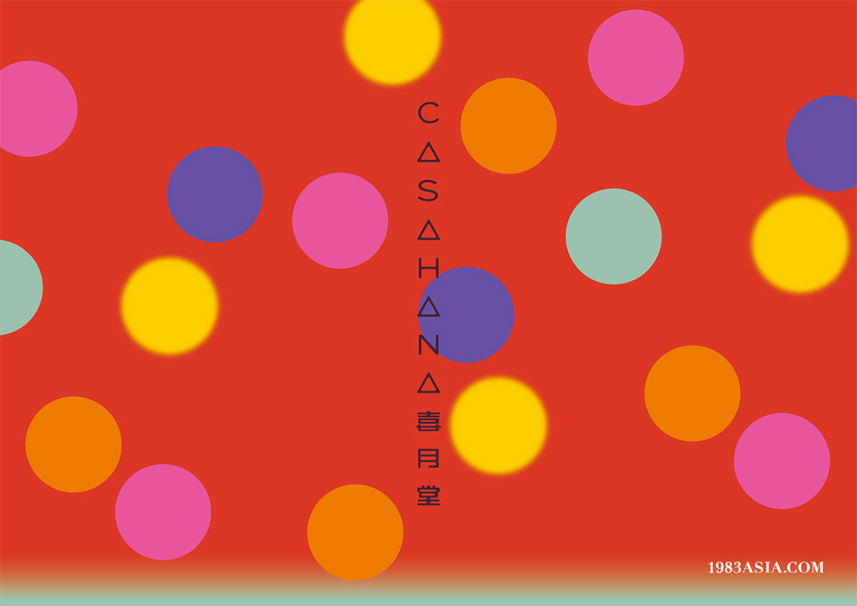


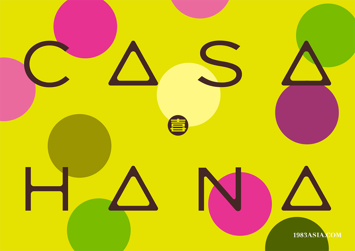


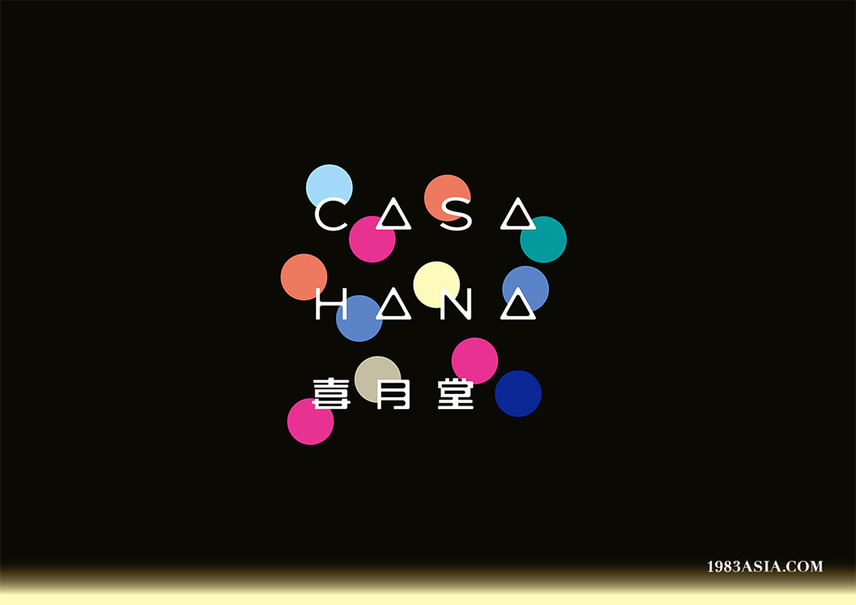

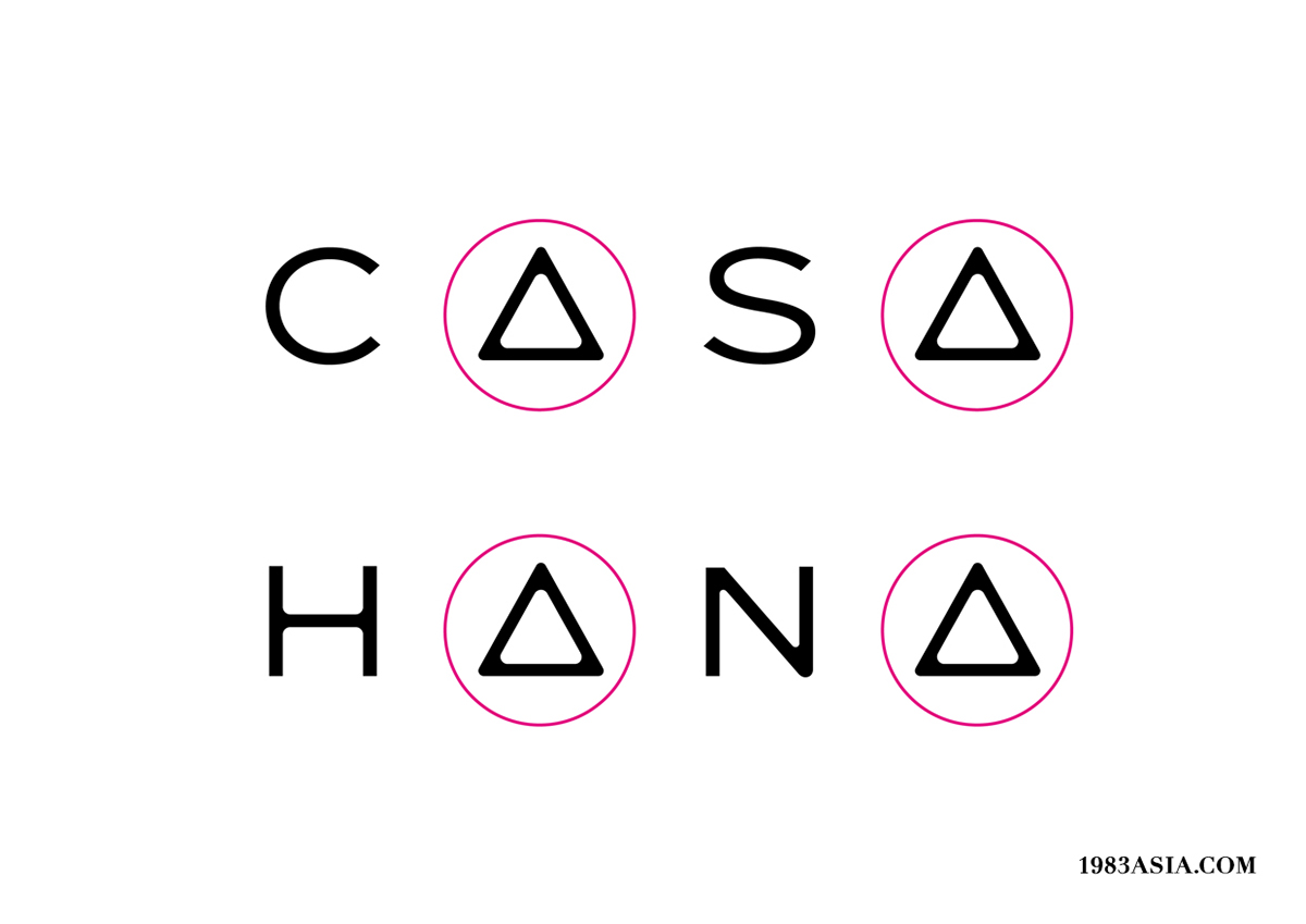
CASAHANA’s customers are from different countries and of different races, thus communication should be from a global perspective. We first consider English and Chinese, and choose words and characters in bold, with free-style design, creation and detailed modification, symbolized design to strengthen visual memory, styles of English words and Chinese characters will be harmonized to form a universal mix, giving out the flavor of happy life.
喜月堂的客户来自不同国家不同种族,因此必须站在全球的角度看待信息传播的问题。我们首先考虑以国际通用语言英文结合中文,并选用兼容性较佳的黑体为基础,作大幅度的设计创作与细节的修饰,符号化的设计增强视觉记忆,并将中英文字的风格作高度统一,设计成适应性强的多元组合模式; 字里行间皆焕发趣致欢愉的生活气息。


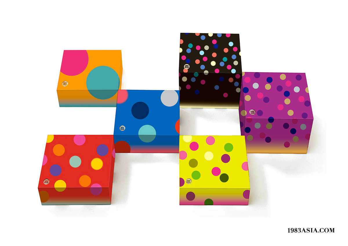
Brand design is not a logo, or certain font, but a visual system with its own story. We find core symbols exclusive to CASAHANA. No matter cosmopolitan festival cultures, warm and slow living ideal, or innovative and mixed taste, all can be integrated into the concept of “delight & moon”. These lay a solid foundation for the diversified development of the brand in future, development of brand story, etc. Visual system will be effectively extended to packaging, promotion, space and different dimensions, building consumers’ confidence.
品牌设计不是一个标志,或字体;而是具故事性的视觉系统。我们为喜月堂找到专属于品牌的核心符号,无论是多元民族的节庆文化,热情慢活的生活理想,还是产品创新混搭的口味;都可以在极具包容性的“喜月”概念下作各种可能性的混搭,为品牌日后多元发展建立稳固的基础,发展品牌故事,而视觉系统将有效的展开到包装,推广,空间......等不同的维度,为消费者埋下一颗信心。


1983ASIA
一切皆源於信念
EVERYTHING STARTS WITH A BELIEF
WEB:www.1983asia.com
WECHAT:1983亚洲造
MAIL: the_1983@foxmail.com
TEL: +86-0755-86233262
ADD:中国深圳华侨城创意园北区B3栋东侧604
604, B3 building, OCT loft north area, Nan Shan district, 518000, Shen Zhen, CHINA.


